Vue.jsを使ってレスポンシブ対応かつ切替可能なモーダルを作成する
今回はVue.jsを使って切り替えが可能なモーダルウィンドウを作成していきたいと思います!
デモページを用意したのでご覧ください。
今回はVue.jsの公式サイトで紹介されている「モーダルコンポーネントの例」を参考に、自己流にアレンジしてみました。
モーダルコンポーネント — Vue.js
https://jp.vuejs.org/v2/examples/modal.html
また、弊社のブログでも過去にJQueryを使った作成方法を紹介しています。
JQueryを使って作成したものと比べていただくと、JQueryとVue.jsの比較にもなるかと思います!
jQueryでレスポンシブ対応かつ切替可能なモーダルを作成する方法
https://www.tipdip.jp/tips_posts/production/2090/
それでは早速、Vue.jsを使って作成していきたいと思います。
HTMLとJSを記述する
まずはHTMLを記述していきたいと思います。
head内でVue.jsを読み込んでいきましょう。
- HTMLのhead内に記述
-
        <head>
        ・
        ・
        中略
        ・
        ・
        <script src="https://cdn.jsdelivr.net/npm/vue"></script>
        </head>
        </pre></dd>
これでVue.jsを使う準備が完了しました!
早速、body内にモーダル部分を記述していきましょう!
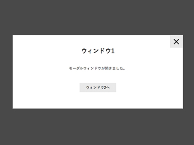
- HTMLのbody内に記述
    <body>

    <div id="modal">

        <!--モーダルを開くボタンの部分-->
        <div class="modalArea">
            <p>クリックするとモーダルを開きます</p>
            <ul>
                <li @click="showModal = 1">1を開く</li>
                <li @click="showModal = 2">2を開く</li>
                <li @click="showModal = 3">3を開く</li>
            </ul>
        </div><!--modalArea-->


        <!--モーダルの中身-->
        <modal v-if="showModal == '1'" @close="showModal = false" :key="1">
            <h3 slot="header">ウィンドウ1</h3>
            <div slot="body">
                <p>モーダルウィンドウが開きました。</p>
            </div>
            <div class="link_area" slot="footer">
                <p class="modal-default-button" @click="showModal = 2">
                ウィンドウ2へ
                </p>
            </div>
        </modal>
        <modal v-else-if="showModal == '2'" @close="showModal = false" :key="2">
            <h3 slot="header">ウィンドウ2</h3>
            <div slot="body">
                <p>
                    あのイーハトーヴォのすきとおった風、<br>
                    夏でも底に冷たさをもつ青いそら、うつくしい森で飾られたモリーオ市、<br>
                    郊外のぎらぎらひかる草の波。<br>
                    <br>
                    この様にウィンドウの高さが違う場合でも<br>
                    この様に表示することができます。
                </p>
            </div>
            <div class="link_area" slot="footer">
                <ul>
                    <li class="modal-default-button" @click="showModal = 1">ウィンドウ1へ</li>
                    <li class="modal-default-button" @click="showModal = 3">ウィンドウ3へ</li>
                </ul>
            </div>
        </modal>
        <modal v-else-if="showModal == '3'" @close="showModal = false" :key="3">
            <h3 slot="header">ウィンドウ3</h3>
            <div slot="body"></div>
            <div class="link_area" slot="footer">
                <p class="modal-default-button" @click="showModal = 2">
                    ウィンドウ2へ
                </p>
            </div>
        </modal>
    </div><!--modal-->


    <!--モーダルの中身のテンプレート-->
    <script type="text/x-template" id="modal-template">
        <transition name="modal">
            <div class="modal-mask">
                <div class="modal-wrapper" @click.self="$emit('close')">
                    <div class="modal-container">
                        <div class="modal-header">
                            <slot name="header"></slot>
                        </div>

                        <div class="modal-body">
                            <slot name="body"></slot>
                        </div>

                        <div class="modal-footer">
                            <slot name="footer"></slot>
                        </div>
                    </div>
                </div>
            </div>
        </transition>
    </script>

    <script src="./js/func.js"></script>

    </body>
こんな感じです。
少し長いですが、おおまかに『モーダルを開くボタンの部分』、『モーダルの中身』、『モーダルの中身のテンプレート』の3つに分かれています。
仕組みの説明の前に、『func.js』の中の記述を見てみましょう
- func.js内の記述
-
    Vue.component('modal', {
        template: '#modal-template'
    })

    new Vue({
        el: '#modal',
        data: {
            showModal: false,
        }
    })
『#modal-template』をコンポーネント登録し、モーダル部分のテンプレートとして使用しています。
モーダルの開閉や、どのモーダルを表示するかは『showModal』の値で制御しています。
開閉時のアニメーションは『<transition>』と『CSS』で行っています。
CSSを記述する
参考までに、今回のデモで使用したCSSを記述します。
- CSS
-
    #modal {
        margin: 3vw;
    }

    #modal ul {
        overflow: hidden;
        padding: 0;
        list-style: none;
    }

    #modal .modalArea ul li {
        display: inline-block;
        width: 100px;
        text-align: center;
        line-height: 30px;
        background: #ddd;
        font-size: 14px;
        cursor: pointer;
        transition: background 0.3s, color 0.3s;
    }

    #modal .modalArea ul li:hover {
        color: #fff;
        background: #42b983
    }

    .modal-mask {
      position: fixed;
      z-index: 9998;
      top: 0;
      left: 0;
      width: 100%;
      height: 100%;
      background-color: rgba(0, 0, 0, .5);
      display: table;
      transition: opacity .3s ease;
    }

    .modal-wrapper {
        height: 100%;
        display: flex;
        align-items: center;
    }

    .modal-container {
        width: 80%;
        max-width: 840px;
        margin: 0 auto;
        padding: 60px 2vw 80px;
        border: 2px solid #aaa;
        text-align: center;
        background: #fff;
        box-sizing: border-box;
        box-shadow: 0 2px 8px rgba(0, 0, 0, .33);
        transition: all .3s ease;
    }

    .modal-header h3 {
        margin-top: 0;
        color: #42b983;
        font-size: 30px;
        text-align: center;
        font-weight: bold;
    }

    .modal-body {
      margin: 20px 0;
    }

    .link_area {
        overflow: hidden;
        max-width: 410px;
        margin: auto;
        text-align: center;
    }

    .link_area .modal-default-button {
        cursor: pointer;
        display: inline-block;
        background: #e6e6e6;
        width: 180px;
        line-height: 40px;
        text-decoration: none;
        color: #000;
        margin: 0 10px;
        font-size14px;
    }

    // モーダル開閉時のアニメーション

    .modal-enter {
      opacity: 0;
    }

    .modal-leave-active {
      opacity: 0;
    }

    .modal-enter .modal-container,
    .modal-leave-active .modal-container {
      transform: translateY(30px);
    }
こんな感じです!
まとめ
いかがでしたでしょうか?
以前作成したJQueryのものと比べてもらうと、かなりシンプルな記述になっているのを確認いただけたのではないでしょうか。
またアニメーションをつける場合にVue.jsの方が簡単なので、そこに大きくメリットを感じる方は多いかもしれません!
では、また。
2019.01.16