jQueryでレスポンシブ対応かつ切替可能なモーダルを作成する方法
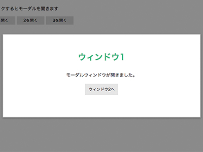
今回は切り替えが可能なモーダルウィンドウの作成方法をご紹介します。
まずはデモページを用意したのでご覧ください。
今回はこれを作っていきたいと思います。レスポンシブにも対応していますので使い勝手は良いかと思います!
それでは早速、次項から詳しく説明していきたいと思います。
HTMLを記述
まずはHTMLを記述していきます。
- HTMLを記述する
-
<head>

  <link rel="stylesheet" type="text/css" href="css/style.css" media="screen" />
  <script src="https://ajax.googleapis.com/ajax/libs/jquery/3.0.0/jquery.min.js"></script>
  <script src="js/func.js"></script>

</head>

<body>

<div id="demoslide01" class="main_visual bg_aaa">
  <p><a data-target="modal1" class="modal_open">クリックするとモーダルウィンドウが開きます</a></p>
</div>


<!-- モーダル1 -->
<div id="modal1" class="modal_box">
  <h2>ウィンドウ1</h2>
  <p>モーダルウィンドウが開きました。</p>

  <div class="link_area">
    <p class="modal_link"><a data-target="modal2" class="modal_switch"><span>ウィンドウ2へ</span></a></p>
  </div>

  <p><a class="modal_close"><i class="zmdi zmdi-close"></i></a></p>
</div>

<!-- モーダル2 -->
<div id="modal2" class="modal_box">
  <h2>ウィンドウ2</h2>

  <p>あのイーハトーヴォのすきとおった風、<br />夏でも底に冷たさをもつ青いそら、うつくしい森で飾られたモリーオ市、<br />郊外のぎらぎらひかる草の波。<br /> <br />この様にウィンドウの高さが違う場合でも<br />この様に表示することができます。</p>

  <div class="link_area">
    <ul>
      <li class="modal_link"><a data-target="modal1" class="modal_switch"><span>ウィンドウ1へ</span></a></li>
      <li class="modal_link"><a data-target="modal3" class="modal_switch"><span>ウィンドウ3へ</span></a></li>;
    </ul>
  </div>

  <p><a class="modal_close"><i class="zmdi zmdi-close"></i></a></p>
</div>

<!-- モーダル3 -->
<div id="modal3" class="modal_box">
  <h2>ウィンドウ3</h2>

  <div class="link_area">
    <p class="modal_link"><a data-target="modal2" class="modal_switch><span>ウィンドウ2へ</span></a></p>
  </div>

  <p><a class="modal_close"><i class="zmdi zmdi-close"></i></a></p>
</div>

</body>
まずはhead内でCSSファイル、jQueryファイル、JSファイルを読み込みます。
ここではCSSファイルとJSファイルの名前をそれぞれ『style.css』と『func.js』としていますが、これは任意で構いません。
モーダル部分について少し解説をすると、『<a data-target=”〇〇”>』と対応する『<id=”〇〇”>』のモーダルを呼び出す形になります。
例えば、最初の『<a data-target=”modal1″>』をクリックすると『<div id=”modal1″>』が呼び出されるということです。
『<a class=”modal_close”>』はモーダルを閉じるボタンです。
『<i class=”zmdi zmdi-close”>』はアイコンフォントを表示する記述です。
アイコンフォントの使用方法はこちらの記事に詳しく記述しているので、そちらも参考にしてみてください。
次にJSファイルを記述してモーダルを動かしていきます!
JSファイルを記述
続いてJSファイルを記述して行きます。
前項のhtmlの記述時に対応するclass名やid名を変更している場合は対応する箇所を書き換えてください!
- func.js
-
$(function(){

  // 「.modal_open」をクリックしたらモーダルと黒い背景を表示する
  $('.modal_open').click(function(){

    // 黒い背景をbody内に追加
    $('body').append('<div class="modal_bg"></div>');
    $('.modal_bg').fadeIn();

    // data-targetの内容をIDにしてmodalに代入
    var modal = '#' + $(this).attr('data-target');

    // モーダルをウィンドウの中央に配置する
    function modalResize(){
        var w = $(window).width();
        var h = $(window).height();

        var x = (w - $(modal).outerWidth(true)) / 2;
        var y = (h - $(modal).outerHeight(true)) / 2;

        $(modal).css({'left': x + 'px','top': y + 'px'});
    }

    // modalResizeを実行
    modalResize();

    // modalをフェードインで表示
    $(modal).fadeIn();

    // .modal_bgか.modal_closeをクリックしたらモーダルと背景をフェードアウトさせる
    $('.modal_bg, .modal_close').off().click(function(){
        $('.modal_box').fadeOut();
        $('.modal_bg').fadeOut('slow',function(){
            $('.modal_bg').remove();
        });
    });

    // ウィンドウがリサイズされたらモーダルの位置を再計算する
    $(window).on('resize', function(){
        modalResize();
    });

    // .modal_switchを押すとモーダルを切り替える
    $('.modal_switch').click(function(){

      // 押された.modal_switchの親要素の.modal_boxをフェードアウトさせる
      $(this).parents('.modal_box').fadeOut();

      // 押された.modal_switchのdata-targetの内容をIDにしてmodalに代入
      var modal = '#' + $(this).attr('data-target');

      // モーダルをウィンドウの中央に配置する
      function modalResize(){
          var w = $(window).width();
          var h = $(window).height();

          var x = (w - $(modal).outerWidth(true)) / 2;
          var y = (h - $(modal).outerHeight(true)) / 2;

          $(modal).css({'left': x + 'px','top': y + 'px'});
      }

      // modalResizeを実行
      modalResize();

      $(modal).fadeIn();

      // ウィンドウがリサイズされたらモーダルの位置を再計算する
      $(window).on('resize', function(){
          modalResize();
      });
    });
  });
});
上手くいっていれば、これでモーダルが表示されるようになっているはずです!
最後にCSSでスタイルを付けていきます。
CSSファイルを記述する
CSSファイルを記述してモーダルにスタイルを付けていきます。
JSと同じように、htmlファイルを記述する際にclass名を変更している場合は、対応するように置き換えてください!
- style.css
-
.modal_open{
    display: inline-block;
    margin: 3vw;
    float: left;
}

.modal_box {
    position: fixed;
    z-index: 7777;
    display: none;
    width: 80%;
    max-width: 840px;
    margin: 0;
    padding: 60px 2vw 80px;
    border: 2px solid #aaa;
    text-align: center;
    background: #fff;
    box-sizing: border-box;
}

.modal_close {
    position: absolute;
    top: 0;
    right: 0;
    display: block;
    width: 62px;
    font-size: 46px;
    color: #000;
    line-height: 62px;
    text-align: center;
    background: #e6e6e6;
}

.modal_close i {
    line-height: 62px;
    vertical-align: bottom;
}

.modal_bg {
    position: fixed;
    top: 0;
    left: 0;
    z-index: 6666;
    display: none;
    width: 100%;
    height: 120%;
    background-color: rgba(0,0,0,0.7);
}

.link_area {
    overflow: hidden;
    max-width: 410px;
    margin: 60px auto 0;
    text-align: center;
}

.link_area .modal_link {
    display: inline;
}

.link_area .modal_link a {
    display: inline-block;
    width: 180px;
    color: #000;
    line-height: 2.5;
    text-decoration: none;
    margin: 0 10px;
    background: #e6e6e6;
}

.link-area ul li.modal_link:first-child a {
    float: left;
}

.link-area ul li.modal_link:last-child a {
    float: right;
}


@media screen and (max-width: 769px) {

/*  ウィンドウサイズ769px以下の時のスタイル  */

  .modal_box {
      padding: 50px 2vw 40px;
  }

  .modal_close {
      width: 40px;
      line-height: 40px;
      font-size: 30px;
  }

  .modal_close i {
      line-height: 44px;
  }

  .link_area {
      margin: 25px auto 0;
  }

  .link_area .modal_link a {
      margin: 15px auto 0;
  }

  .link_area ul li.modal_link:first-child a {
      float: none;
      margin-top: 0;
  }

  .link_area ul li.modal_link:last-child a {
      float: none;
  }

}
モーダル部分の最低限の記述例を書きました。
これを元に使用する環境に合わせて色々カスタマイズしてみてください!
まとめ
以外と簡単な記述で、レスポンシブ対応かつ切り替え可能なモーダルを作ることができました!
カスタマイズ性も高いので、実用的なモーダルだと思います。
ぜひ、試してみてください!
では、また。
2017.11.22